Islanders Reverse Retro
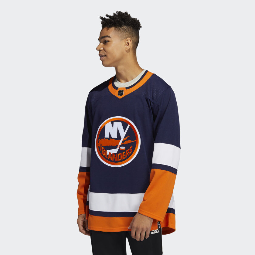
NHL unveiled its Reverse Retro jerseys this month—some of them are a bit hit, some of them are total flops. As an Islander fan, I don’t like what they did with this jersey—which is basically the their current home jersey with the darker navy blue the team used in the early 2000’s. I didn’t like that blue then and don’t like it now—so I started thinking about what I’d do if I were in charge of the design.
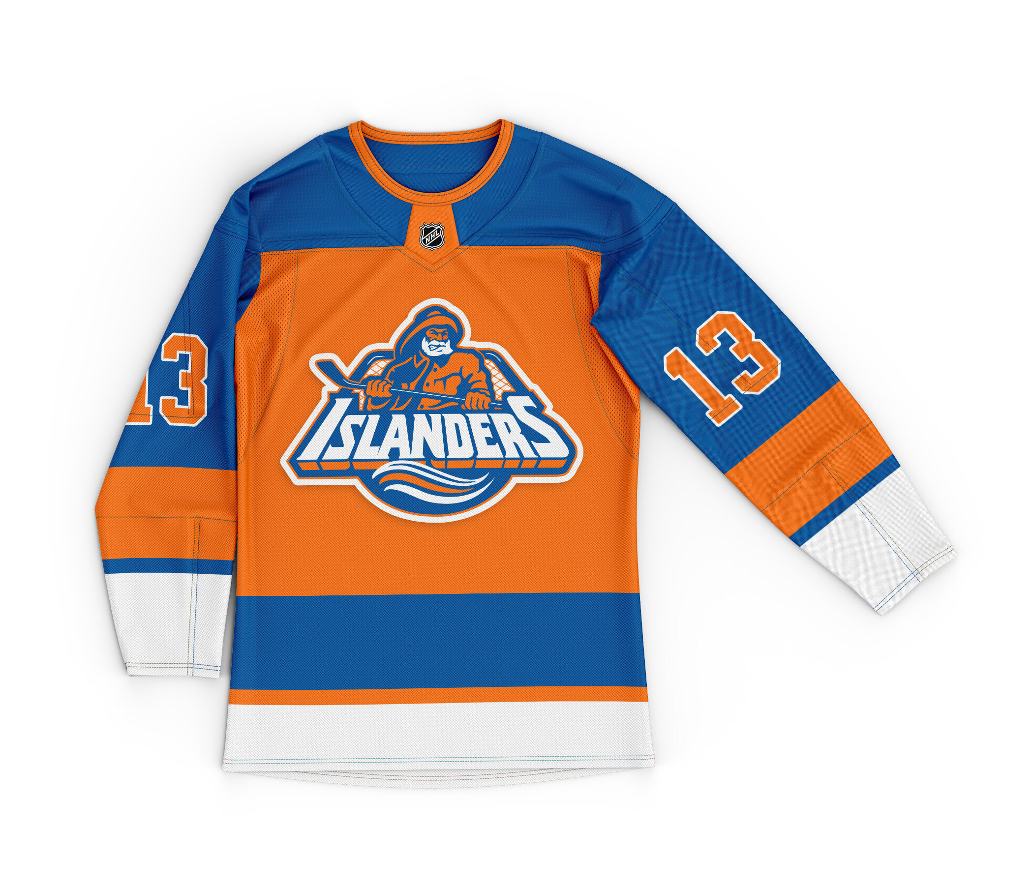
First off, the idea behind Reverse Retro seems to be more playful and outside the box, how could you avoid the fisherman here? It was one of the NHL’s most memorable team branding blunders, and it was also one of the most ambitious and outside the box jersey designs the league has ever seen. It seems perfect to bring it back for this, plus it’s seen a spike in popularity among nostalgic Isles fans recently—give the people what they want! I always wondered what the fisherman would look like in traditional the Isles color scheme and jersey design. I went with the orange numbers to pay homage to the true original jersey worn in ‘72. I still like the Islander jersey set up the way it is today, but this would be a fun RR / third uni IMHO.

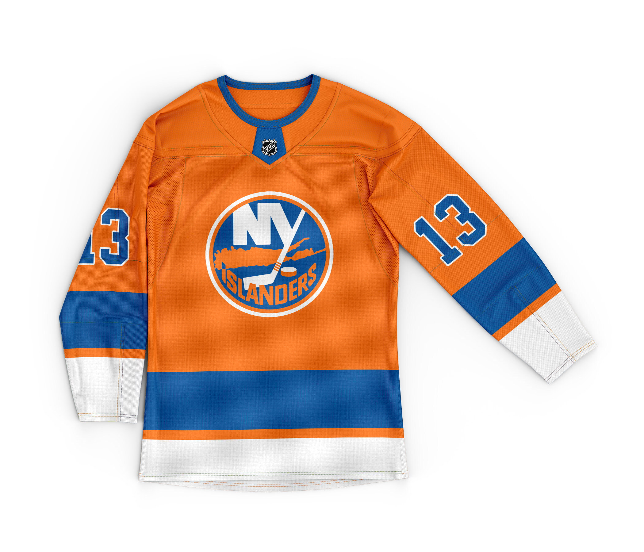
Take 2: Playing up the orange
Take 3: This is a true Reverse Retro, keeping the Islander logo as is and swapping blue and orange.